In the world of stock trading and investing, understanding stock charts is crucial. These charts are more than just lines and bars; they are visual representations of the market’s psychology, reflecting the collective sentiment of traders and investors. Whether you are a beginner or a seasoned trader, mastering how to read different types of stock charts can significantly enhance your ability to analyze the market and make informed decisions.
In this guide, we will explore three main types of stock charts—line charts, bar charts, and candlestick charts. We will delve into how each of these charts is read, their pros and cons, and why candlestick charts are the most favored tool in technical analysis.
1. Line Charts: The Simplicity of Stock Trends
What is a Line Chart?
A line chart is the most basic and straightforward type of stock chart. It connects the closing prices of a stock over a specific period with a continuous line, making it easy to observe the general direction of the stock’s price. This simplicity makes line charts a popular choice for those who want a quick, clear view of a stock’s performance over time.
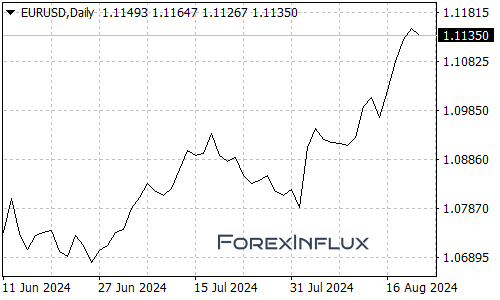
How to Read a Line Chart
- X-Axis (Horizontal): This axis represents the time period, which can range from days to years depending on the chart’s scale.
- Y-Axis (Vertical): This axis shows the stock price, with higher positions on the axis indicating higher prices.
- Line Path: The continuous line tracks the closing prices of the stock. A rising line suggests an upward trend, while a falling line indicates a downward trend.
Advantages of Line Charts
- Simplicity: Line charts are easy to understand, even for beginners.
- Trend Identification: They are excellent for identifying the overall trend of a stock, whether it is bullish (upward), bearish (downward), or neutral (sideways).
- Clarity: With fewer data points to clutter the chart, it’s easier to see the long-term movement of a stock.
Limitations of Line Charts
- Lack of Detail: Line charts only show closing prices, omitting other vital data such as opening prices, highs, lows, and intra-day fluctuations.
- Limited Use for Short-Term Analysis: Because they provide a simplified view, line charts might not be suitable for short-term trading where more detailed price action is crucial.
Best For:
Line charts are best for long-term investors who are more focused on the overall trend of a stock over months or years, rather than the daily fluctuations.
2. Bar Charts: A Detailed Look at Price Movements
What is a Bar Chart?
A bar chart, also known as an OHLC (Open, High, Low, Close) chart, provides more detailed information than a line chart. Each bar on the chart represents one period (which could be a day, week, or month) and shows the stock’s opening price, highest price, lowest price, and closing price for that period.
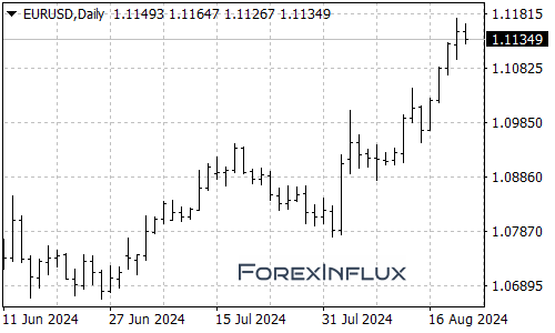
How to Read a Bar Chart
- Vertical Line: The vertical line in each bar represents the range of prices during the period, from the lowest to the highest.
- Left Horizontal Line: This small line on the left side of the bar represents the opening price.
- Right Horizontal Line: The small line on the right side of the bar shows the closing price.
Interpreting the Bars
- Long Vertical Bars: A longer bar indicates greater volatility during the period, meaning there was a significant difference between the high and low prices.
- Short Vertical Bars: Shorter bars suggest less price movement, indicating a more stable trading period.
- Position of the Horizontal Lines: If the right horizontal line (close) is above the left (open), the stock price increased during that period. If the close is below the open, the price decreased.
Advantages of Bar Charts
- Detailed Information: Bar charts provide a comprehensive view of the trading activity within each period, including the range of prices and the direction of price movement.
- Volatility Indicators: The length of the bars and their positions can indicate how volatile the stock was during the period.
Limitations of Bar Charts
- Complexity: Bar charts can be more challenging to read, especially for beginners, because they present a lot of information at once.
- Less Visual Intuition: Compared to candlestick charts, bar charts may not be as visually intuitive, making it harder to spot patterns quickly.
Best For:
Bar charts are particularly useful for traders who need to understand daily price movements and market volatility. They are ideal for those who need a detailed view of a stock’s performance over short periods.
3. Candlestick Charts: The Favorite of Technical Analysts
What is a Candlestick Chart?
Candlestick charts are similar to bar charts but with a more visual and intuitive format. Each “candlestick” on the chart represents the opening, high, low, and closing prices for the trading period, with the body of the candle representing the range between the opening and closing prices.
The origins of candlestick charts date back to 18th-century Japan, where they were used to analyze the price of rice. Today, they are the most popular chart type among technical analysts due to their ability to convey a wealth of information in a compact, easy-to-read format.
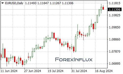
How to Read a Candlestick Chart
- Candlestick Body: The rectangular body of the candlestick shows the difference between the opening and closing prices.
- Wicks (Shadows): The thin lines above and below the body, known as wicks or shadows, represent the high and low prices during the period.
- Color Coding: Typically, a green (or white) candlestick indicates that the stock closed higher than it opened (bullish), while a red (or black) candlestick indicates that the stock closed lower than it opened (bearish).
Interpreting Candlesticks
- Long Body Candlesticks: A long body indicates strong buying or selling pressure. A long green candle suggests strong buying, while a long red candle suggests strong selling.
- Short Body Candlesticks: A short body suggests indecision in the market, where the opening and closing prices are close to each other.
- Doji Candlesticks: A Doji forms when the opening and closing prices are almost equal, indicating indecision or a potential reversal in the market.
Common Candlestick Patterns
- Hammer and Hanging Man: These single-candle patterns can indicate potential reversals. A hammer appears after a downtrend and suggests a potential bullish reversal, while a hanging man appears after an uptrend and suggests a bearish reversal.
- Engulfing Patterns: A bullish engulfing pattern occurs when a small red candle is followed by a larger green candle that completely “engulfs” the red candle, signaling a potential bullish reversal. Conversely, a bearish engulfing pattern is a small green candle followed by a larger red candle, indicating a potential bearish reversal.
- Morning Star and Evening Star: These are three-candle patterns that suggest a potential reversal. A morning star occurs at the bottom of a downtrend and indicates a bullish reversal, while an evening star occurs at the top of an uptrend and indicates a bearish reversal.
Advantages of Candlestick Charts
- Visual Appeal: Candlestick charts are visually intuitive, making it easier to spot trends and patterns at a glance.
- Comprehensive Data: They provide all the information found in bar charts but in a more visually digestible format.
- Pattern Recognition: The various candlestick patterns help traders identify potential reversals, continuations, and indecision points.
Limitations of Candlestick Charts
- Overwhelming Detail: For beginners, the abundance of information and the variety of patterns can be overwhelming.
- Requires Practice: Effective use of candlestick charts requires an understanding of the patterns and what they signify, which can take time to master.
Best For:
Candlestick charts are the go-to tool for technical analysts and traders who want to decode market sentiment and predict future price movements. They are especially useful for short-term trading and for identifying entry and exit points based on specific patterns.
Which Chart Type is Most Commonly Used for Technical Analysis?
Among the three types of charts, candlestick charts are the most commonly used in technical analysis. Their ability to present detailed information about market sentiment, combined with their visual clarity, makes them an indispensable tool for traders. The patterns that form on candlestick charts often provide early signals of potential price reversals or continuations, giving traders a crucial edge in timing their trades.
Why Candlestick Charts Dominate Technical Analysis:
- Pattern Recognition: Candlestick charts are excellent for identifying and interpreting specific price patterns that can indicate future price movements.
- Market Sentiment: The color and size of the candlesticks give immediate visual cues about the market’s mood, whether it’s bullish, bearish, or indecisive.
- Versatility: Candlestick charts are flexible enough to be used across different time frames, from minutes to months, making them suitable for various trading strategies.
Conclusion
Understanding how to read different types of stock charts is essential for anyone looking to navigate the complexities of the stock market. While line charts offer simplicity and clarity, bar charts provide detailed insights into daily price movements. However, candlestick charts stand out as the most versatile and informative tool for technical analysis. Their ability to visually represent market sentiment and identify patterns makes them the preferred choice for traders seeking to predict future price movements and make informed trading decisions.
By mastering these chart types, you will be better equipped to analyze stocks, spot trends, and improve your trading strategies, ultimately enhancing your potential for success in the market.